This is the Windows 8 Tablet & PC Interface
by Anand Lal Shimpi on June 1, 2011 10:26 PM EST- Posted in
- Trade Shows
- Microsoft
- Computex 2011
- Windows 8
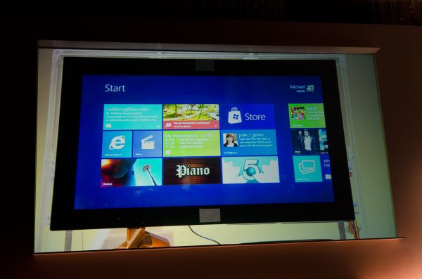
Here's a quick look at the new start screen for Windows 8 running on a Dell XPS Development Tablet. The tablet supports both touch and external keyboard interfaces. The UI is ridiculously smooth, it seems even quicker than Windows Phone 7.
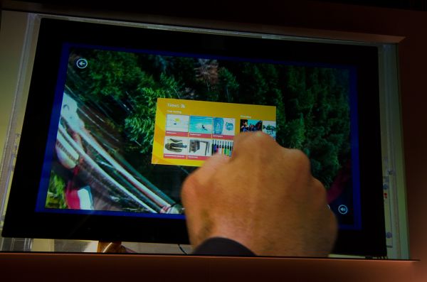
On tablets Windows 8 will support PlayBook like bezel gestures (the gestures actually take place on the first pixel next to the bezel, apparently not in the bezel itself). Gestures for the OS take place on the left/right edges of the screen, while app gestures happen on the top/bottom bezel.
Swipe in from the right to reveal the start button, and swipe in from the left to multitask. You just swipe between active apps like you would on a PlayBook.
The interface doesn't require a touchscreen, Microsoft showed how you can multitask or switch between screens using a keyboard on a standard PC as well. This will be a common interface across all Windows 8 devices, tablet or standard PC.
Tapping the start button switches between the standard Windows desktop and the new tile interface. You can even display multiple applications on the screen at the same time using Windows 8's snap feature.
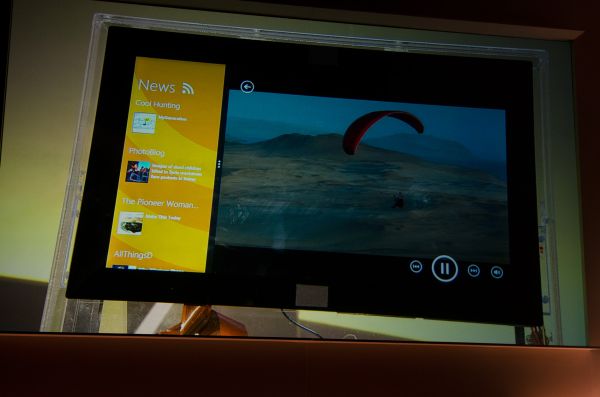
With a widescreen display (apparently snap isn't supported yet on 4:3s) you can display two apps side by side in the new tablet style UI:
You can even have a standard Windows 8 desktop on one side and a new Windows 8 app on the other.
Microsoft also mentioned that Windows 8 will have the same system requirements or lower vs Windows 7.
Gallery: Windows 8 Tablet & PC Interface


33 Comments
View All Comments
cj100570 - Wednesday, June 1, 2011 - link
Looks like a winner.... Or not.inighthawki - Wednesday, June 1, 2011 - link
I'm not 100% sure if your comment is sarcastic or not, but tbh you cannot tell how well it will work till you 1) try it out, and 2) let them finish it. To me it looks like a great combination, especially for tablets/touch interfaces, but it's not likely I blindly made up my mind and assumed it's good or bad before even trying it.ahmedz_1991 - Thursday, June 2, 2011 - link
for me, the comparison will be between Microsoft's W8 and Google's "Ice Cream Sandwich"sprockkets - Wednesday, June 1, 2011 - link
Nowhere is it explained how old x86 apps will work on ARM based Win8 machines.Seeing as how hit or miss it is with x86 vs. x86-64, I'm not holding my breath.
nafhan - Thursday, June 2, 2011 - link
I'm guessing recompiled at a minimum. Any devs that want to take advantage of the new UI paradigms will have to rebuild anyway, though.Keep an eye out for an app store announcement is my guess... :)
Lucian Armasu - Thursday, June 2, 2011 - link
They won't be. Their focus with the new UI seems to to be HTML5 webapps. So ARM tablets will only have webapps on them..just like Chrome OS.taeren - Wednesday, June 1, 2011 - link
I think this looks very promising. It's about time graphical user interfaces started moving out of standard patterns that have plagued us for the past 20+ yearsFair enough for the power user, this may not look that exciting but my impression is the standard user only wants to accomplish very simple tasks, which therefore should mean a very simple and intuitive interface.
It'll be very interesting to see how Microsoft intends to handle writing code to multiple platforms
mino - Thursday, June 2, 2011 - link
Did you ever wonder why those standard interfaces managed to "plague" us for the past 30+ years ? (yes, it is that long)Maybe, just maybe, it had something to do with use productivity ?
(I have yet to see how a further Bling! and obfuscation of computer interfaces increases productivity ...)
getho - Thursday, June 2, 2011 - link
I'd like to be able to use that tablet to control my desktop machine. I could ditch the wacom tablet. That sort of integration might be enough to make me ditch android. In fact thats really what MS needs to look at now: they need to outgoogle google in terms of integration and using the cloud. (same contacts, emails, tabs, calls, messages on whatever device). not holding me breath thoughStormyParis - Thursday, June 2, 2011 - link
I like the "dual panel" setup in the last photo.I do hope the home screen is configurable though. In the first picture it looks ugly, very busy, and filled with junk I don't want.