Xbox 360 Companion for Windows Phone, Xbox Live for iOS Apps Released
by Brian Klug on December 7, 2011 11:35 PM EST- Posted in
- Smartphones
- Microsoft
- Xbox 360
- Mobile
- windows phone
- iOS
The Xbox team has been rather busy lately. On Tuesday, the team delivered the most sweeping facelift of the Xbox 360 dashboard since NXE, and today released an Xbox Companion app for Windows Phone 7 and My Xbox Live for iOS. We've had a little bit of time to troll around inside the two and thought it worthwhile to go over the very different features the two offer in conjunction with an Xbox 360.
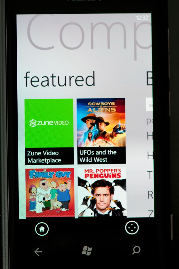
To start, the behavior of Xbox Companion for WP7 is very much analogous to Apple's Remote for iOS. Xbox Companion offers basic control over the dashboard and inside applications (including directional controls and a/b/x/y buttons) in addition to the ability to both control media playback, launch games, view friend activity, and search using Bing. The Xbox 360 under control has to have Companion enabled under Console Settings, but after that all that's required is a Live ID user and password on the app. Control works over cellular data or WiFi, though WiFi of course affords much lower input latency and better experience.
Again, Xbox Companion really acts in practice like a remote for an attached 360, and does a pretty good job replacing a the IR Xbox 360 media center remote if you have a WP7 smartphone handy. Xbox Connector finally gets close to the kind of integration that we've been waiting for between WP7 and the 360, and using it as a remote is fluid if you're using it over WiFi with good connectivity.
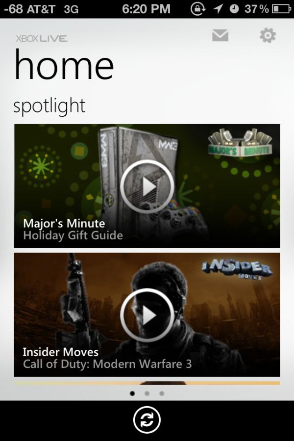
My Xbox Live for iOS eschews the control and remote functions of its WP7 counterpart, and instead gives you control over Xbox Live messaging, friends, and an achievements browser. It's slightly surreal to see and use a Metro-style UI on iOS, but the interface is extremely fluid.
There isn't nearly as much function here as Xbox Compaion, as unsurprisingly Microsoft wants to keep some of that control exclusive to the WP7 counterpart. That said, sending text-based messages over Xbox Live is way easier on the iOS app than it is on the 360 unless you have a chatpad or use voice.
Source: WP7 Marketplace, Apple App Store, Major Nelson Blog (1), (2)


5 Comments
View All Comments
MaximillianSterling - Thursday, December 8, 2011 - link
It's worth noting that Microsoft's Photosynth app on iOS has had the Metro UI for a while now (and yes it's definitely surreal).Articuno - Thursday, December 8, 2011 - link
Ads, ads, ads, ads, all I see on the 360 dashboard is ads. The actual buttons to access your content are two little things on the left and the entire right side, plus the huge button is all ads, on every page.Even the WP7 application (I refuse to say "app") has video ads all over it when you open it. How is this remotely acceptable, especially in the PAID VERSION of Xbox Live?
woofersus - Thursday, December 8, 2011 - link
Well, as far as I can see (from pictures - I don't own an xbox) the ads are primarily for content you can purchase through the service, which is relevant and makes sense although I can see it getting annoying if it's excessive enough to get in the way of content you already have rights to use. (reviews have not indicated that's the case though)Android market does the same thing on my phone, with books, movies, and such that I could buy all over the landing page.
brosephus - Thursday, December 8, 2011 - link
Tried it but it didn't enhance my experience at all. A regular controller got things done much better. The two areas where this could have actually been useful are keyboard and voice input - neither of which are available. If you go to a search box you're presented with xbox control buttons instead of a keyboard.bakonator - Saturday, December 10, 2011 - link
BS. Microsoft makes money off of most android devices sold, yet no android app